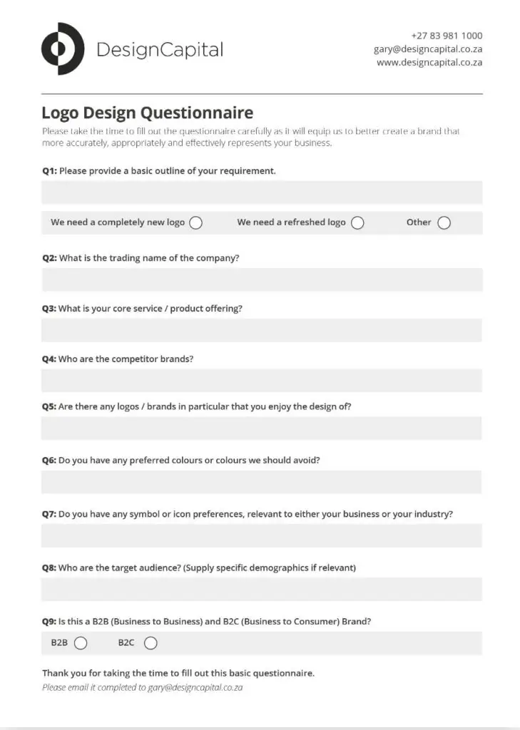
Ask your client these 9 questions before designing their logo:
Why it’s so important to start your design here:
Getting to know the client as a person, and their brand as a personality, is pivotal to the success of the design direction and, as designers, we are usually dealing with clients from a diverse range of industries and business sectors.
One week we could be working with a beauty salon and the next with an accounting firm, and then the following week with an auto-body repairer. While the principles of design remain the same regardless of which business sector we are designing for, each of these industries and sectors has its own set of dynamics, nuances, and considerations that need to be taken into account.
One of the biggest mistakes a designer can make is to take the self-centred, ‘know it all’ attitude with a new client. I have seen and heard of these instances so many times when taking on a new client as they share about these experiences with their previous design agency.
The designer has the responsibility to partner with their new client to fully understand their business, brand personality, brand goals, specific requirement, as well as their industries’ unique dynamics and sensitivities.
Below are some key questions to be asked during this phase:
"If there is time to do it twice, then there is time to do it right the first time."
Unknown Tweet
Q1: Please provide a basic outline of your requirement.
As obvious as this may sound, as designers we can often go to a new client meeting making assumptions about what is required, and this can possibly be, and usually is, to our detriment. It is vital that we allow the client to express what lead them to the point where they have reached out to engage our services. For example, they may be happy with where their logo is at but feel it just needs a refresh, and then you come walking into the meeting with a gung-ho attitude to ‘shake things up’ and change their identity altogether, which is usually not wise and not what they had in mind to begin with.
Take the time to meet them, to understand where they are currently at, and allow them to feel comfortable and believe you have their best interests at heart. Remember that the brand they have, at the time of your meeting, may have been with them for many years with its own history, legacy, and meaning, and to disregard this would be very unwise, not just professionally, but also strategically.
Some ‘typical’ scenarios of new client brands:
- “We are starting a new company and need a completely new logo.”
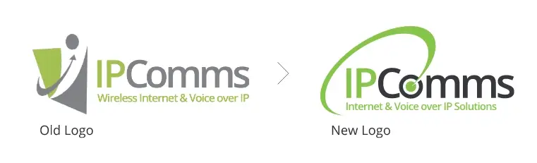
- “We have been around for some time, and we have a logo, but we don’t really like it and want something new that will more accurately and appropriately represent us”
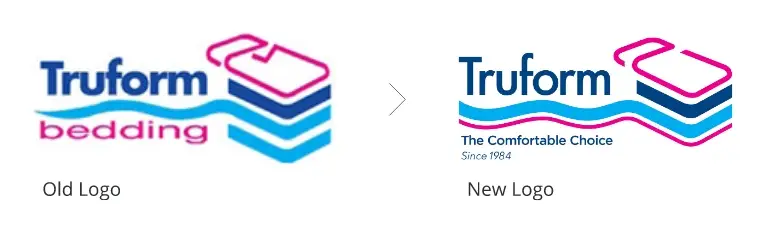
- “Our brand is quite established, and our customers know and trust it, but we feel we would like to freshen it up and make it more modern.”

See some actual scenario examples below that I have worked on:
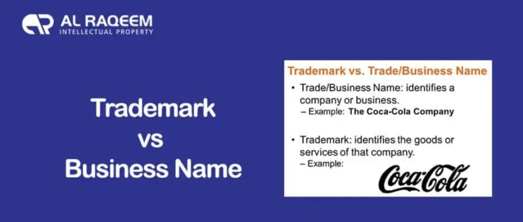
Q2: What is the trading name of the company?
As obvious as this may seem, you will be surprised how often the trading name of a business may be different to what you anticipated – sometimes the registered name of a company is different to the trading name.
Credit: https://alraqeem.ae/trademark/a-trademark-vs-business-name-do-you-know-the-difference/
Q3: What is your core service / product offering?
Usually, a business offers either products or services, and in some cases they offer both. Knowing their core product, service and speciality is vital, as this could influence the concept and style of the logo. For example, the client may be a law firm, but you get some firms that focus on commercial law and some that focus on family law – the logo for the firm focused on family law would possibly have a feeling of ‘warmth and legacy’, whereas the firm targeting commercial clients would want to convey a more clinical, and serious tone. Warmth and legacy, for example, could be conveyed by a more classic serif font, whereas seriousness, for the commercial law firm, could be conveyed by a contemporary sans serif font. This is a very simplified example, but it illustrates the importance of knowing these details about the client, as they significantly influence the subtle design nuances of the brand. I am reminded of this very pertinent quote, once again by Paul Rand:
"Design is so simple, that is why it's so complicated"
Paul Rand Tweet
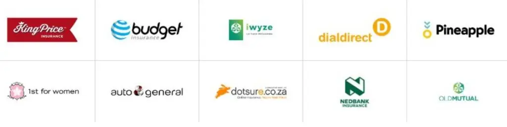
Q4: Who are the competitor brands?
It is important to know their competitor brands and what they ‘look like’ as the target audience would likely be comparing your client’s brand to that of their competitors. As the designer, it will also be helpful for you to know what their competitors look like as you will notice any colours and symbols that may be typically associated with their industry. It will also be vital that you don’t present any designs, and possibly colour combinations or symbols, that are too similar to that of their competitors.
Credit: https://www.comparecarinsurance.co.za/
Q5: Are there any logos / brands in particular that you enjoy the design of?
This question is important because each client has their own idea of what they like, connect with, relate to, and regard as appealing and appropriate. Knowing this is vital for consideration when deciding on your creative approach.
Q6: Do you have any preferred colours or colours we should avoid?
This is important because opinions on colour are very subjective and it is important to present, as far as possible, some options in the client’s preferred colours – firstly to appease them and to entertain their request, and secondly, to show them whether their chosen colours can work. Also, we try not to present a new logo in a colour that the client simply doesn’t like, as it will possibly ruin any chance of a ‘good design’ being considered, as all they may likely see is the colour they don’t like and look past the great design and concept.
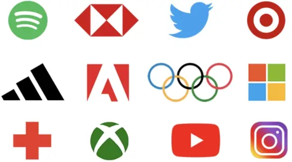
Q7: Do you have any symbol or icon preferences, relevant to either your business or your industry?
There may be symbols that are overused in their industry, or symbols that the client particularly relates to and identifies with. Knowing this also makes your job easier, as you will have a conceptual starting point. Remember, your client knows their industry much better than you ever will. Knowing more about which symbol is most relevant really helps if you are presenting an option using ‘Logo Model A or B’ (discussed in more detail in Step 3 of my book: ‘The Logical Logo’).
Credit: https://www.thelogocreative.co.uk/top-12-logo-design-trends-for-2022/
Q8: Who are the target audience? (Supply specific demographics if relevant)
Knowing as much as possible about the target audience will ensure you consider all of the contributing factors towards the design approach: Font, style, colour, design, symbolism etc.
Q9: Is this a B2B (Business to Business) and B2C (Business to Consumer) Brand?
The approach taken for a B2C logo is usually very different from that of a B2B logo. We will go into this more, later in the book.
The above is part of Step-1 from 7-Steps for designing a logo successfully for your clients. Below you can download a FREE questionnaire template and BUY the book ‘The Logical Logo’ as a PDF or Audiobook.
FREE Client Questionnaire
A step-by-step guide for freelance Graphic Designers to achieve more repeatable logo design success.